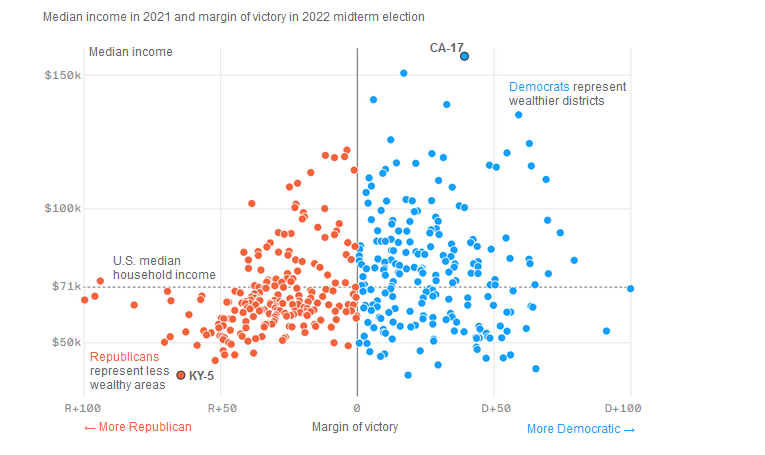
The chart below comes from an Axios article published last year.
First, the chart answers the following question. Which party performs better (a larger margin of victory) in wealthy congressional districts versus less wealthy congressional districts?
The horizontal axis shows the margin of victory in 2022 midterm congressional elections.
Margins below zero represent Republican victories. The more negative the margin, the stronger Republican performance.
Conversely, margins above zero represent Democrat victories. Stronger Democrat performances are then represented by higher positive numbers.
Second, the vertical axis shows median income of the congressional districts. It runs from just below $50K to over $150K.
Many people believe Republicans generally represent the wealthy and Democrats the working and middle classes.
That’s not necessarily the case.
The chart shows that Republicans tend to represent poorer districts while Democrats wealthier districts. In fact, 9 of the top 10 wealthiest districts Democrats represent.
On the chart, locate CA17 for Democrats (upper right hand corner) and then KY-5 for Republicans (bottom left).
There are of course exceptions to the pattern. See the lower right quadrant and upper left quadrants.
Democrats have become the party of wealthier, educated voters while Republicans the party of the working class.
As quoted by the article, “Republicans were the party of the country club, and they’re increasingly the party of the country.”